Early last year, I worked on the redesign of a rather content-heavy website. Design requirements were fairly light: the client asked us to keep the organization’s existing logo and to improve the dense typography and increase legibility. So, early on in the design process, we spent a sizable amount of time planning a well-defined grid for a library of content modules.
Over the past few years, this sort of thinking has become more common. Thanks to the advocacy of Mark Boulton, Khoi Vinh, and others, we’ve seen a resurgence of interest in the typographic grid, and how to use it on the web. And frankly, the idea’s been a smash hit: a million CSS frameworks have bloomed, with sundry tools to complement them, each built to make grid-based design even more accessible to the average designer. And why not? After a few minutes of griddy thinking, the benefits become clear: designers gain a rational, structured framework for organizing content and users gain well-organized, legible sites.
However, our client had one last, heart-stopping requirement: the design had to be fluid and resize with the browser window. Normally, this would cause me to rejoice both noisily and embarrassingly. Fluid layouts are an undervalued commodity in web design. They put control of our designs firmly in the hands of our users and their browsing habits. They’ve also utterly failed to seize the imagination of web designers.
Minimum screen resolution: a little white lie#section2
Instead of exploring the benefits of flexible web design, we rely on a little white lie: “minimum screen resolution.” These three words contain a powerful magic, under the cover of which we churn out fixed-width layout after fixed-width layout, perhaps revisiting a design every few years to “bump up” the width once it’s judged safe enough to do so. “Minimum screen resolution” lets us design for a contrived subset of users who see our design as god and Photoshop intended. These users always browse with a maximized 1024—768 window, and are never running, say, an OLPC laptop, or looking at the web with a monitor that’s more than four years old. If a user doesn’t meet the requirements of “minimum screen resolution,” well, then, it’s the scrollbar for them, isn’t it?
Of course, when I was coding the site, I didn’t have the luxury of writing a diatribe on the evils of fixed-width design. Instead, I was left with a sobering fact: while we’d designed a rather complex grid to serve the client’s content needs, the client—and by extension, the client’s users—was asking for a fluid layout. As almost all of the grid-based designs I could list off at that time were rigidly fixed-width, I was left with a prickly question: how do you create a fluid grid?
As it turns out, it’s simply a matter of context.
Do I really have to thank IE for this?#section3
Faced with an insurmountable problem, I did what I do best: avoid it altogether. Temporarily putting aside the question of how to get a grid to behave in a non-fixed layout, I coded the stuff I knew: styles first for color and backgrounds, and then for setting the type.
You may already know about Internet Explorer’s well-documented problem with resizing fonts set in pixels—or rather, its utter refusal to do so. Set a paragraph in 16px Georgia, and no matter how much the user tries to increase or decrease the size of the text, it remains at 16px in IE. IE7 and onward do allow the user to scale the entire page, but simple resizing of px-based fonts is still largely verboten in Internet Explorer. So to give our users the most flexibility, we standards-savvy designers have usually opted to sidestep the pixel entirely, and have taken to sizing type with relative units, be they keywords, percentages, or my personal favorite, ems.
If you’ve ever worked with relative units such as the em, you know that it’s all about context: in other words, the actual size of an element’s em is computed relative to the font-size of its parent element. For example, let’s say we’re working from the following design comp:

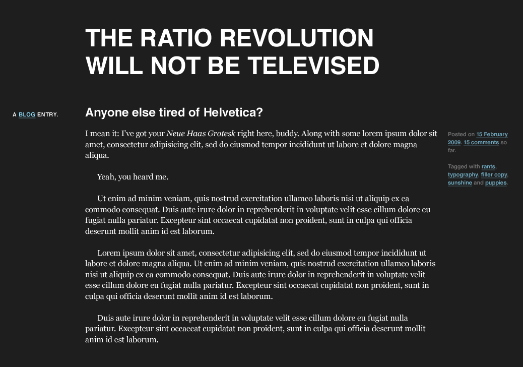
An example of some basic text sized using pixels.
Nothing fancy: some paragraphs set in 16px Helvetica, an unordered list that’s been slightly downsized to 14px, and an h1 at the top in 24px Georgia. Sexy, no?
What’s doubly sexy is that one simple rule allows us to get most of this in place:
body {
    font: normal 100% Helvetica, Arial, sans-serif;
}
With a font-size of 100%, all the elements in our page are sized relative to the browser’s default type size, which in most cases is 16px. And thanks to the browser’s default stylesheet, the h1 is big, bold, and beautiful—but still in Helvetica, and much too large. So while it’d be easy enough to slap on a font-family to fix the header’s Helvetica problem, how do we size the text to 24 pixels? Or accurately reduce the size of that list?
With ems, it’s easily done. We take the target value for each element’s font-size in pixels and divide it by the font-size of its container (that is, its context). We’re left with the desired font-size, expressed in relative, em-friendly terms. Or to put it more succinctly:
target ÷ context = result
If we assume the body’s default type size to be 16px, we can plug each desired font-size value into this formula. So to properly match our header to the comp, we divide the target value (24px) by the font-size of its container (16px):
24 ÷ 16 = 1.5
So the header is 1.5 times the default body size, or 1.5em, which we can plug directly into our stylesheet.
h1 {
    font-family: Georgia, serif;
    font-size: 1.5em;        /* 24px / 16px = 1.5em */
}
To size the list to the em-equivalent of 14px, we can use the same formula. Assuming again that the body’s font-size is roughly 16px, we simply divide that target by the context:
14 ÷ 16 = 0.875
And we’re left with a value of 0.875em, which we can again drop into our CSS.
ul {
    font-size: 0.875em;      /* 14px / 16px = 0.875em */
}
With those two rules, our sample page is looking a lot closer to the comp, and will be practically pixel-perfect after some slight cleanup. All with the help of our target ÷ context = result formula.
So after a few hours spent cleaning up relative type styling for our client, I realized I’d stumbled upon the answer. If we could treat font sizes not as pixels, but as proportions measured against their container, we could do the same with the different elements draped across our grid.
After all, it’s not “The Golden Pixel”#section4
As before, let’s start with a fairly unsexy straightforward layout:
Sure, our “design” is pretty modest. But those simple styles are draped over a well-defined grid: namely, seven columns of 124px each, separated by 20px-wide gutters, all of which totals up to a width of 988px. But hey, let’s forget about those nasty pixels. Proportions are the new black, right? Let’s get fluid, baby.
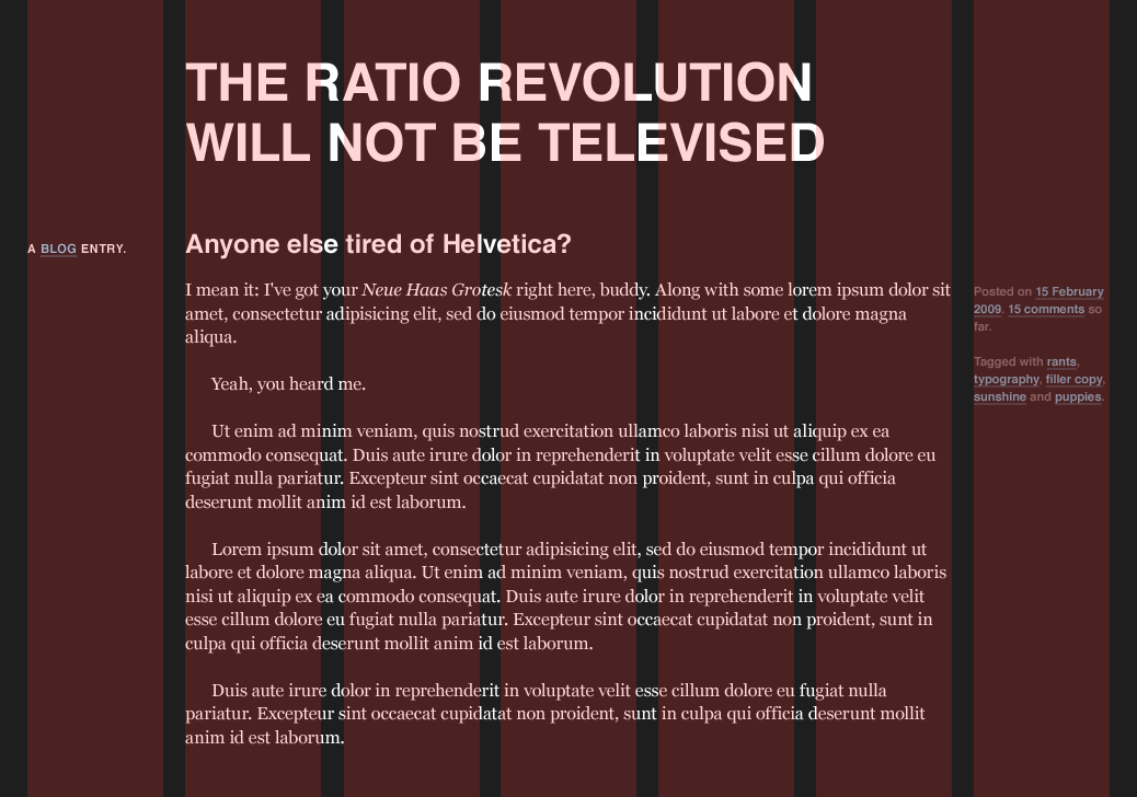
To start, let’s treat our comp like any other, fixed or fluid: before we start coding, let’s look at the design, and assess the different content areas. Thankfully, it’s a pretty short inventory.

On the highest level, we’ve got a title at the top, a content area that spreads across six columns, and some contextual information in the leftmost column. From this diagram, we can flesh out some skeleton markup that keys into our content inventory, both structurally and semantically:
<div id="page">
    <h1>The Ratio Revolution Will Not Be Televised</h1>
    <div class="entry">
        <h2>Anyone else tired of Helvetica?</h2>
        <h3 class="info">A <a href="#">Blog</a> Entry:</h3>
        <div class="content">
            <div class="main">
                <p>Main content goes here. Lorem ipsum etc., etc.</p>
            </div><!-- /end .content -->
            <div class="meta">
                <p>Posted on etc., etc.</p>
            </div><!-- /end .meta -->
        </div><!-- /end .main -->
    </div><!-- /end .entry -->
</div><!-- /end #page -->
And with some type rules applied, we’ve got a respectable-looking starting point. However, the #page container doesn’t have any constraints on it, so our content will simply reflow to match the width of the browser window. Let’s try to rein in those long line lengths a bit:
#page {
    margin: 40px auto;
    padding: 0 1em;
    max-width: 61.75em;      /* 988px / 16px = 61.75em */
}
We’ve used margins and padding to ventilate our design a bit, and establish a gutter between it and the window edges. But in the last line of our rule, we’re using a variant of our font-size formula to define the maximum width of our design. By dividing the comp’s width of 988px by our base font-size of 16px, we can set a max-width in ems to approximate the pixel-based width from our mockup, which will prevent the page from exceeding our ideal of 988px. But since we’ve used ems to set this upper limit, the max-width will scale up as the user increases her browser’s text size—a nifty little trick that even works in older versions of Internet Explorer, if a small CSS patch is applied.
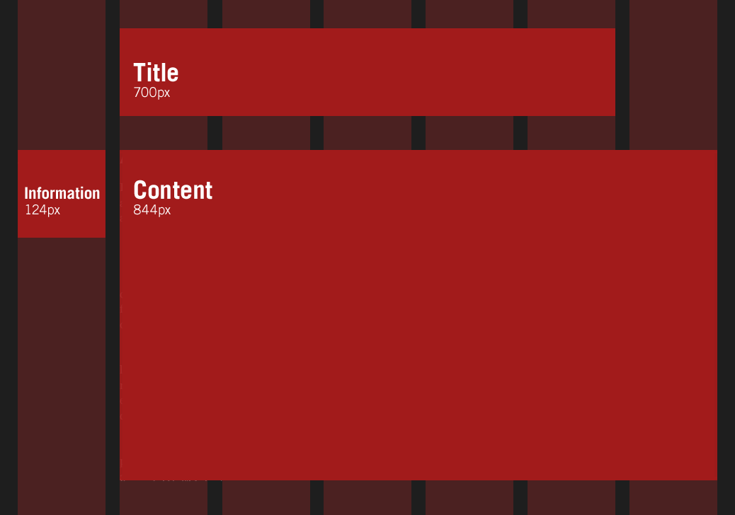
So with our design properly cordoned off, let’s begin working on each element in our design inventory, beginning with the page’s title. In the comp, it spans five columns and their four gutters, with a total width of 700px. It’s also removed from the left-hand edge of the page by one column/gutter pair, making for a nice 144px offset. And if we were working in a fixed-width design, our job would be pretty straightforward:
h1 {
    margin-left: 144px;
    width: 700px;
}
Since we’re working in a fluid context, though, fixed measurements don’t quite cut it. And as I was working on relative font sizing, that’s when it hit me: every aspect of the grid—and the elements laid upon it—can be expressed as a proportion relative to its container. In other words, as in our type resizing exercise, we’re looking not just at the desired size of the element, but also at the relationship of that size to the element’s container. This will allow us to convert our design’s pixel-based widths into percentages, and keep the proportions of our grid intact as it resizes.
In short, we’ll have a fluid grid.
Everything old is new again#section5
So, how do we begin?
target ÷ context = result
That’s right: it’s the return of our trusty type formula. We can use the same proportional analysis to transform pixel-based column widths into percentage-based, flexible measurements. So we’re working from a target value of 700px for the page’s title—but it’s contained within a designed width of 988px.

Converting our pixel-based title to percentages.
As a result, we simply divide 700px (the target) by 988px (the context) like so:
700 ÷ 988 = 0.7085
And there it is: 0.7085 translates into 70.85%, a width we can drop directly into our stylesheet:
h1 {
    width: 70.85%;           /* 700px / 988px = 0.7085 */
}
Can we do the same with our target margin of 144px? Oh, I do so love a leading question:
144 ÷ 988 = 0.14575
Once again, we can take that 0.14575, or 14.575%, and add that directly to our style rule as a value for the title’s margin-left:
h1 {
    margin-left: 14.575%;    /* 144px / 988px = 0.14575 */
    width: 70.85%;           /* 700px / 988px = 0.7085 */
}
And voilà. By measuring the title’s margin and width in relation to its container, we’ve successfully translated the ratios from our grid into CSS-friendly percentages. The title’s proportions will always remain intact, even as it reflows to fit the size of the browser window.
We can even perform the same simple division to wrap up the layout for the entry itself, sized at 844px in our comp, with some 124px-wide marginalia to the left of it. For the entry:
844 ÷ 988 = 0.85425
And for the informational column:
124 ÷ 988 = 0.12551
These two quick divisions net us some percentages that we can drop into our stylesheet, fleshing out our layout even more:
.entry h2,
.entry .content {
    float: right;
    width: 85.425%;          /* 844px / 988px = 0.85425 */
}.entry .info {
    float: left;
    width: 12.551%;          /* 124px / 988px = 0.12551 */
}
And with that, our fluid grid shapes up a bit further.
Changing the context#section6
So far we’ve got the big content areas sorted, but we’ve yet to touch the inner area. Currently, the blog entry’s main copy and its contextual info occupy the full width of the entry, and are stacked on top of each other. But in our initial comp, the main copy inside the blog entry only spanned five columns, with the ancillary info slotted neatly into the rightmost column.
Sharp readers will have noticed that, as it’s currently designed, the entry’s body is the same width as the page’s title (700px), and the marginalia is the same width as the leftmost column we styled earlier (124px). So while we’re working with some dimensions we’ve previously calculated, we can’t reuse the same formulas: the context has changed.

Since we’re working inside a new container, we need to use its width as our context.
Whereas before we were calculating percentages relative to the 988px-wide #page, we’re currently working within .entry .content, which is noticeably smaller. So as a result, we need to redefine our context, and work off the designed width of .entry .content as our reference point. So to define the percentage-based width of the main copy, we take its designed width of 700px, and divide it by 844px:
700 ÷ 844 = 0.82938
And for our 124px-wide column on the right, we can use the same reference point:
124 ÷ 844 = 0.14692
We can now take each of these measurements, and plug them into our CSS:
.entry .main {
    float: left;
    width: 82.938%;          /* 700px / 844px = 0.82938 */
}.entry .meta {
    float: right;
    width: 14.692%;          /* 124px / 844px = 0.14692 */
}
And with that we’ve finished our work, our fluid grid complete.
A note on rounding#section7
As you may guess from the lack of CSS patches above, I’ve had very few cross-browser issues with this technique. I would highly recommend John Resig’s excellent article on Sub-Pixel Problems in CSS. It explains how different browsers handle percentage-based widths, and the mechanics by which they reconcile sub-pixel measurements.
As John explains in his article, if modern browsers are presented with four 25%-wide elements within a 50px-wide container, they can’t actually render the elements at 12.5px; instead, most will round the columns down or up as best fits the layout. Internet Explorer, as it happens, will simply round all of those sub-pixel values up, which breaks layouts.
If you’re working with sufficiently generous margins in your grid, this shouldn’t be an issue. But if IE causes undue wrapping with your percentage-based columns, reducing the target value by one pixel can help. So if, for example, our left-hand marginalia was too wide for IE (Internet Explorer), you might change your calculation from:
124 ÷ 988 = 0.12551
to a lower target of 123px:
123 ÷ 988 = 0.12449
Plug that width of 12.449% into your IE-specific stylesheet, and your layout woes should clear right up.
A grid for all seasons#section8
The above is, of course, a starting point: there are myriad other challenges that face the liquid web designer, most of which arise when you introduce fixed content (such as images, Flash, and so forth) into a fluid framework. I’ve been experimenting with a few possible solutions on my blog, but other, better workarounds are still out there.
And finally, I don’t pretend that design is easy, whether it’s fixed or fluid. But given all that we’ve achieved over the past few years—moving past tables, evangelizing standards in our companies and in our shared industry, demanding better standards of our browsers and our peers—I do wish we’d bend some of that ingenuity to break out of our reliance on “minimum screen resolution.” After all, our users’ browsing habits aren’t as fixed as our comps would suggest. I hope the promise of fluid grids has fired your imagination, and I’m excited to see how you improve on the technique. Our users will be, too.
Additional reading#section9
As you may have gathered from my introductory crazed rant digression, two passions of mine are fluid web design and, more recently, the importance of a well-considered grid. Both of these have been fueled by the following, though this isn’t an exhaustive list:
- John Allsopp, A Dao of Web Design
- Mark Boulton, Feeling your way around grids
- David Emery, More Width
- Molly Holzschlag, Thinking Outside the Grid
- Jeremy Keith, The unpushed envelope
- Jeffrey Zeldman, Rules-based design
And finally, at the end of a talk I gave last August on designing for fluid grids, someone pointed out the Fluid 960 Grid System. If you’re using a public CSS framework such as 960 Grid System already, the fluid “port” might be of interest to you.
“Dan”:http://www.alistapart.com/comments/fluidgrids?page=5#50 , thanks for the comment. I’d respond that beyond its obvious accessibility benefits, page zoom is great for users whose screens are considerably larger than the design’s constraints. But what about users on the other end of the spectrum, viewing your site on an older display, or even in a non-maximized browser window that’s only fifty pixels too narrow? Page zoom is a great, awesome feature, to be sure: but the onus is still on us (and on our designs) to be as flexible as possible.
Just to underline a point that some other folks have tripped on: fluid grids do _not_ rely on @max-width@, whether it’s set in @em@s, pixels, or even percentages. Rather, I was just using that as an example to show how the ratio calculation works. Sorry for any confusion that might’ve caused.
This article is a great weight lifted. The beauty of simple math coupled with elegance, creating a balanced design.
This is worth of a hard copy posted next to the work station.
I actually use a fixed width column for my menu and a fixed height for my header, but have made the content section fluid using javascript. I found a script that gets the window size (inner size +/- scroll bars). Using javascript I then ‘re-write’ my width and max-height CSS for both onLoad() and onresize(). This allows my content area to be fluid while the header and menu remain fixed. I won’t contend that my design is the best, but it is better than it was previously (when designed strictly for a 1280×1024 maximized browser window).
Many thanks. Just the sort of article I really enjoy on ALA (we need more!). Really helped me to understand the concept of relativity when coding fluid designs. Thank you so much.
There has already been a few mentionings of good tools for easy conversions between pixels and EM:s. When it comes to font sizes I recommend our “EM Table”:http://www.oktavilla.se/em_table. I think it’s really handy.
Taking this one step further, we can use JavaScript to auto-resize the base font-size. Making it proportional to the width of the browser window does two things:
1) The layout’s width can stretch beyond 998 pixels.
2) You maintain the same word-count per line of text for widths above 998px (plus or minus a word). In other words, high-resolution screens won’t suffer from ridiculously wide columns.
Here’s a quick and dirty script I wrote to do that. Widths below 1024px will maintain a 100% base font-size, while widths above 1024px will receive a proportionally larger base font-size.
As an example, I’ve added this script to the fluid grid example here: http://www.bionicdreamer.com/fluidgrids/final.html
Notice that if you increase your browser’s window width beyond 1024px, both the layout and its font grows larger while maintaining the same word count per line of text.
Hmmm, looks like my script got mangled by the comment system. Here’s another try:
Also being discussed in “Fluid Grids on Accessify Forum”:http://www.accessifyforum.com/viewtopic.php?t=13288 .
The articles on ALA have been pretty getting pretty “meta” over the past couple of years, imho.
But these 6 pages of positive comments and ideas accompanying show _this_ is the sort of article ALA should go back to. Widely applicable, non-hacky front-end and backend techniques which improve adaptability and usability. That’s what “people who make websites” like to read about.
Textile is pretty lame, even compared to Markdown and others of that ilk. (You can’t put punctuation immediately after a link!) Having said that, the live preview is very handy and works perfectly.
Thank you! This is something I had “half figured out” on my own and messed around with. You gave us a clear, concise description and cleared up some of the finer points for me – and thanks for the formula! That made my day!
And I agree with previous posters who said this is the kind of article they like to see. Thanks again!
Yeah, using percentage widths is a great way to maximise space. As some have pointed out, the downside can be that lines of text get very long and that isn’t easy to read.
The use of “max-width” should solve this, but IE doesn’t support it well up to IE7.
Anyway, one point you mentioned is the use of fixed size elements such as images and Flash.
Flash at least can be resized using percentages: leave off the height parameter and add a “%” to the width parameter value. It will scale relative to its parent, which of course in turn can be styled using percentages in CSS.
More info here: http://animation.about.com/od/flashanimationtutorials/ss/flashexpandwind_2.htm
If the images are purely decorative, Flash does a fairly decent job of scaling them, even past their prime, so a little Flash image-display widget could be a solution. Of course you can use CSS % for images too, but then it’s up to the browser to scale, which can look bad.
As a thoroughly math-challenged designer, I found this article well written and helpful. I was able to use it to start building a new, fluid site, and plan to retrofit the other sites I maintain to be fluid and thus more user-friendly. This is a perfect example of the web medium truly coming into its own, moving beyond a screen version of printed documents. Huzzah!
If you use body {fontsize: 62.5%;} this will set the body font-size 10px. So you don’t need to calculate each time. You can set max-width: 98.8em; 988 / 10 = 98.8.
You don’t need a calculater next to you.
Sorry this is posted somewhat after the fact; my RSS feed for this thread wasn’t updating. Thanks so much for your comments, all.
A few responses:
“Geoffrey”:http://www.alistapart.com/comments/fluidgrids?page=6#56 , thanks for posting that. You might also check out “that auto-leading jQuery plugin”:http://www.ollicle.com/2007/jun/03/jquery_lineheight_flexible.html I mentioned earlier.
“Chris”:http://www.alistapart.com/comments/fluidgrids?page=6#60 , great feedback on fixed-width elements. I’ve actually had a fair bit of luck using percentages on “images”:http://unstoppablerobotninja.com/entry/happy-mica/ and “Flash”:http://unstoppablerobotninja.com/entry/scratch-that-dirt/ alike; “as I told Ryan”:http://www.alistapart.com/comments/fluidgrids?page=5#41 , the quality loss isn’t half as bad as I would’ve thought, especially with a minor JS patch for IE.
“Shin”:http://www.alistapart.com/comments/fluidgrids?page=7#63 , that’s only true if the element you’re sizing is still referencing the @body@’s @font-size@ —that is, if none of its ancestors have had their @font-size@ changed. Otherwise, you’ll need to reference the new, calculated value at that point in the document.
Thanks again for the great feedback, everyone! Keep it coming.
I think Fluid Layouts are simple to make.
All we need to do is keep our mind of measurement in percentages. Thus the term, “Think in Percentage”.
Fonts may or may not be important, but to me, they are not as important as blocks.
The blocks are mandatory to have a percentile width.
Restriction may be applied to make the site look prettier in targeted browsers. Such as using “max-width”, or “min-width” and added Javascript hacks to imitate the min-width for ie6.
Additionally the best hack I seen is from deviantArt.
It takes advantage of the overflow and display property in CSS. Thus making the Cite look very good in CSS.
If anyone’s interested, I recently wrote “a blog entry on fluid images”:http://unstoppablerobotninja.com/entry/fluid-images/ to hopefully address some of the questions in this thread.
Thanks again for reading, and for all the great feedback.
Just happen to notice that when you zoom in on the text using Google Chrome that the text overflows the columns? Does not happen in IE 8.
I’ve been really excited about the developments on this site. From the texture atlas with sprites and background positioning, and now this! I’m here to express my gratitude for the work you are doing and to keep it up. Also, if you need any graphic work done on the fly drop me an email and I could probably help out since ALA has helped out so much.
Thanks again! 😛
Thanks for an excellent walkthrough Ethan. I used a similar approach when working on the “website for the Swedish government”:http://www.sweden.gov.se/ a few years ago. The only drawback with this technique is that, with a complex design, it tends to become rather complicated after a while. So it’s not as easy as using pixels, but for some projects it’s definitely worth it!
This has been really helpful to me along with all of the other great content on ALA. I will be sure to try and use this method myself.
Normally I never liked fluid layouts much because of having to figure out the normative numbers. Using ems as a relative number method has given me a shinier outlook on fluid design.
Thanks!
First I’d like to say that I really enjoyed reading your article, it was very honest and encapsulated many modern web design issues.
However to get to the point I would like to throw up the issue of tables. The reason why tables were previously loved by web designers is because they could do very simply what you had to with css. *They create flexible grids.* I understand completely why we dropped tables in favour of divs, but tables were essentially a grid framework for the internet. I know they had their downsides, but they did provide some consistency to web design. Don’t forget your past!
First off, kudos on a fantastic article: well written and informative.
After reading your article, I’m still unsure of why a designer would employ this technique as framework, outside of a direct client request. I don’t really see “minimum screen resolution” as necessarily evil. Web designers are constantly presented with a range of cantankerous situations – fluid design is just another variable, and to be honest, I don’t think fluid websites are anymore future proof than there fixed width siblings. We change them every few years anyway. Furthermore, the web community has this unquenchable desire to fully accommodate the user at the expense of design; while I clearly understand the necessity of usability and accessibility, I’m not quite sure when it becomes too sanitized, and frankly boring. I think putting the control firmly in the hands of the user is a bad idea, and has been detrimental to the other design communities: think American automobile industry. I’m not against the idea, but I think it should be employed when the situation or design calls for it, not as a framework.
Excellent article, I feel like this solution has been hidden all these years because many web developers (such as myself) often tend to steer away from em’s and %’s for obvious cross-browser reasons among others.
Will defiantly be adding this to my favorites!
Thanks Ethan. Great Article. Fluid design solutions seems to be the way to go.
Excellent article. 🙂
You have to watch out with percentages though with fluid grids, as these are not crossbrowser.
Seem like webkit based browsers have trouble with them. Aswell as Opera. Gecko and Trident seem to handle percentages better.
Here’s a example of a excellent fluid grid. Take a look at them in Firefox and IE and then look at them in Safari and Chrome. You can see that webkit based browsers can’t handle percentages like 25.5% that good.
http://www.designinfluences.com/fluid960gs/
This doesn’t appear to address concerns about fluid vertical spacing, how does that work?
http://doctype.com/EuS
Thank you,
Andrew J. Leer
Excellent article. Just a quick question, is it possible to use fluid (percentage based) line heights? I’ve tried a couple of times but can never get it to work – as in, the line-height does not adjust when the browser is resized.
Any ideas?
Dan
Here’s a very helpful tool I found that’s a nice companion to this well-written and valuable article: http://www.29digital.net/grid
Enjoy!
DC
In your HTML example you might want to look at the commenting. Even though DIV closing tags all look the same, closing tag comments does not.
In your example it looks like you have an incorrect DIV nesting structure because the content class DIV is closed right after the opening of the main class DIV, and then the main class DIV is closed later on.
A small issue really, in an overall very interesting article!
I always found ems and % to be a little confusing but this is a great article and i think it convinced me to give it one more try.
Noticed this too. Original post by mcn:
“In your HTML example you might want to look at the commenting. Even though DIV closing tags all look the same, closing tag comments does not.
In your example it looks like you have an incorrect DIV nesting structure because the content class DIV is closed right after the opening of the main class DIV, and then the main class DIV is closed later on.
A small issue really, in an overall very interesting article!”
http://www.alistapart.com/comments/fluidgrids/P70/#78
Ethan I agree with you that fixed-width design is evil but how to get away from it without using dreaded percentage tables or other methods was not always easy. Your presentation of the fluid grid is well done and makes it simple to understand and execute.